12 Posts from February 2011
Health Spending: The Territories Versus the The Provinces
- Feb 26, 2011
- Posted By: Livio Di Matteo
- Tags: provinces, public health spending, territories
Whenever numbers for public sector health spending in Canada are
presented, the national totals invariably obscure regional stories and
when those regional stories are told they inevitably focus on the
provinces. It is interesting when examining government health
expenditure numbers to separate out the territorial governments. The
accompanying figure presents real per capita (in 1997 dollars)
government health spending numbers from the Canadian Institute for
Health Information for the period 1975 to 2010 for the Yukon, the
Northwest Territories and Nunavut (after 1998). There is also
alongside the combined figure for the remaining ten
provinces. The upward trend is obvious for health spending,
though per capita spending totals are more pronounced for the
territories as opposed to the provinces. Real per capita government
health spending in Canada is highest in the sparsely populated
territories due to factors like high transportation costs as well as the
absence of economies of scale when providing health care in such low
population density regions. In 2010, real per capita government
health spending was approximately 2,580 dollars in the provinces
compared to 3,740 dollars in the Yukon, 4,280 dollars in the Northwest
Territories and 6,000 dollars in Nunavut. Between the years 2000
and 2010, real per capita government health expenditures grew 46 percent
in the Yukon, 19 percent in the Northwest Territories, 29 percent in
Nunavut and 34 percent in The Provinces. What is interesting is
how closely real per capita government health spending in the
territories tracked the provinces from 1975 to 1985. After 1985,
the Northwest Territories moves away from The Provinces as well as the
Yukon while the Yukon pulls away from The Provinces in the early
1990s. Is population aging a factor? Interestingly enough,
while the population in the three territories is “aging”, the proportion
of population over age 65 is still substantially less than that for The
Provinces. Health spending in the territories is currently for a
relatively younger population than for the rest of the country.
Given that health spending rises with age, real per capita health
spending in the territories would probably be even higher if its age
distribution resembled that of the provinces.


Why Big Cities Still Matter (Despite the Internet)
- Feb 26, 2011
- Posted By: Livio Di Matteo
- Tags: economy, internet, new york, social network, technology, urbanization
It is often remarked that place no longer matters as much in the
new knowledge economy. Provided you have a net connection, you can
do business around the world from the most geographically obscure and
out of the way places. Indeed, you can retire to a bucolic
paradise far away from the congestion and bustle of a large metropolitan
center with its smog, traffic and chaos and plug into the many
opportunities of the knowledge economy or engage in net-based
commerce. In the long run, one would expect the elites of the
world to migrate away from the large cities leaving them to the poor
rabble. Yet, a visit to the quintessential world metropolitan
center of New York provides a telling lesson as to why that is not
necessarily the case.
The metropolitan statistical area of New York-Northern New Jersey-Long Island, NY-NJ-PA has a population of 19 million people with the city of New York itself at about 8 million people of whom 1.6 million are clustered into the 59 square kilometers of Manhattan. New York and region is incredibly, noisy, congested, expensive, and a constant assault on the senses and yet since 2000 has added over 700,000 people to its population – an increase of about four percent.
The obvious economic advantages of being in a large densely populated market area are not enough to explain why New York is still such a desirable place to be. Despite the internet and online social networks, living and working in New York is ultimately being a part of the original living social network - a giant stage play where everyone has a part in seeing and being seen. From the wealthiest dealmaker or broker, to the doorman at the hotel, to the worker behind the deli counter, being in New York is being in a dense population pool of opportunity and interaction. The density of population offers agglomeration and scale economies as well as what can best be termed as the interaction economies of face-to-face contact in what is the greatest city in the world. There are simply millions of people to meet and deal with in all walks of life. This knowledge provides an energy and intensity of interaction that is ultimately an end in itself. Whatever your chosen field, the top performers in that field eat, shop, live, play and dine together in a social setting that provides a context for comparison of relative success and further spurs competition. This energized engagement even extends to events such as a Broadway play where the applause and cheers of an audience during the performance interrupts and lets the performers know how they are doing. In New York, silence is not the quiet affirmative, it is failure.
In the end, it is all about the social dimension. The Internet does offer business opportunities in areas far away from your own modest abode but the human element is absent and being human is what it's all about. Being human is why large cities will continue to grow and why social institutions that focus on human face-to-face contact will continue to thrive albeit with the assistance of technology.
Thunder Bay Investment Trends Show Improvement
- Feb 21, 2011
- Posted By: Livio Di Matteo
- Tags: building permits, economic activity, investment, thunder bay
The building permits issued by the City of Thunder Bay as reported by the Thunder Bay Community Economic Development Corporation (CEDC) provide an indicator on investment spending in the areas of residential, commercial, industrial and institutional investment. The total number of permits issued declined from 1990 to 2006 but since 2006 there has been an upward trend in the number of permits issued and 2010 –at 1,252 permits - represents the best year since 1993 (See Figure 1). Along with the number of permits, their total value is also important as an indicator of how much new investment spending is being injected into the local economy. The total value of permits exhibited a downward trend from 1990 to 2000 but since 2000 has also shown an increasing trend with some fluctuations. In 2010, 151.3 million dollars worth of permits were issued – up dramatically from 71.3 million dollars in 2009.
Figure 1

As Figure 2 illustrates, since 2001, the value of residential permits has exhibited a recovery while commercial permits have also seen an increase. On the other hand, industrial and institutional permits have not seen a similar recovery. In some respects, these trends represent both the past and the future. The 1990s were generally a poor period in Thunder Bay’s economy and this weak performance was reflected by a downward trend in the value of all permit categories. The forest sector crisis has meant that since 2000, the value of industrial permits has continued to be low. However, the transitioning of Thunder Bay to a more knowledge intensive economy, opportunities in mining and a growing aboriginal population have seen investment activity pick up especially in the residential and commercial sectors.
Figure 2

Debt Interest and Provincial Spending: A Longer Term View
- Feb 21, 2011
- Posted By: Livio Di Matteo
- Tags: canada, debt, fiscal policy, interest rates, provinces
As interest rates begin to creep upward, one of the main impacts
will be on debt holders as they are faced with higher payments to
service their debts. Governments in Canada will be no exception
and it is interesting to examine provincial government debt service
costs to see which provinces may be most sensitive to a tightening of
interest rates. Figure 1 below plots real per capita debt service
costs (1997 dollars) for each province for the period 1075 to 2008 –
ending just on the cusp of the great recession and financial crisis
which sparked a big increase in provincial debt. As the graph
shows, rising interest rates and debt during the 1980s saw a steep rise
in per capita debt service costs, which peaked in the mid-1990s and then
came down. This decline represents an enormous fiscal dividend
that the provinces used in part to reduce taxes but also to increase
their program spending as Figure 2 reveals. At the end of this
time period, the highest per capita debt service costs were being paid
by Quebec at just over $1,000 per capita, followed by New Brunswick at
about $880 dollars and then Newfoundland and Labrador at $830. The
lowest costs were incurred by Alberta at about $120 per capita, then
British Columbia at $420 and then Ontario at $560. These numbers
suggest that the provinces that are most sensitive to a fiscal squeeze
brought on by rising interest rates and debt brought on by the recession
will be Quebec and the Atlantic provinces in the east and probably
Manitoba in the west. After debt service costs are paid, what is
left is spending on programs. Newfoundland ranks first in real per
capita program (followed by Alberta, PEI and Quebec) spending as of 2008
while Ontario ranks last among the ten provinces. Those provinces
with higher per capita program spending and very high per capita debt
service costs (for example, Quebec and Newfoundland) can be expected to
feel relatively greater fiscal pain than the other provinces).
Figure 1

Figure 2

Figure 1

Figure 2

Provinces face transfer cuts
- Feb 18, 2011
- Posted By: Livio Di Matteo
- Tags: equalization, medicare, provinces, transfer payments
Originally appeared in the Financial Post, February 14, 2011
60% of federal spending is now transfers of one type or another
By Livio Di Matteo
Transfer payments from Ottawa to the provinces have been a feature of the Canadian federation since 1867. Federal transfers began with the Dominion subsidies that provided the provinces with a per-capita payment that essentially acknowledged the new federal government’s stronger tax base. Since then, transfers to the provinces have grown, with the creation of Equalization in 1957 and then health transfers as a result of the Medicare Act of 1966.
Today Ottawa transfers about $56-billion to the provincial and territorial governments, the three main provincial transfer programs being the Canada Health Transfer at $27-billion, the Canada Social Transfer (for child, post-secondary education and social programs) at $12-billion and Equalization (funds for those provinces with a weaker fiscal capacity) at almost $15-billion.
Equalization payments were recently reformed with a new funding formula, but attention is now shifting to health transfers, as the generous funding provisions of the Health Accord reached in 2004 will expire in 2014. The Canada Health Transfer to the provinces has grown from $20.3- billion in 2005 to $27-billion in 2011 — an annual growth rate of nearly 6%.
Given the recent recession and the slowdown in economic growth combined with large federal deficits, the odds are high that the growth rate of these transfers will be circumscribed. However, public health spending over the last five years has grown at a rate of just over 6% annually. Needless to say, there will be a scramble to curtail health costs should health transfers not continue in a manner the provinces have grown accustomed to.
However, the situation is more complicated than that because the federal government not only transfers money to provincial governments but it also transfers money to individuals via income support programs and to bond holders via debt interest payments. Indeed, the role of the federal government over the last 50 years has morphed into a giant check-writing agency. In 2009, along with sending $56-billion to the provincial and territorial governments, it also sent $69-billion to persons (e.g. Old age security, guaranteed income supplements) and another $29-billion to Canadian bondholders as debt interest payments. As a result, almost 60% of federal expenditures is now transfers of one type or another, with the other 40% going to the provision of public goods and services that we usually associate with government. In the early 1960s, the division was the other way around.
If one looks back over the last 20 years, one sees that the share of federal spending accounted for by transfers to persons has stayed approximately constant at 25%. After declining in the 1990s, the share of federal spending going to provincial and territorial government transfers has grown from 14% to about 21%.
Meanwhile, the share of spending going towards debt service dropped from a peak of 30% in the mid-1990s to about 10% at present. The federal fiscal dividend from its balanced budget and the lowest interest rates in 40 years went to increased provincial transfer spending as well as some tax relief at the federal level. Since 1990, total federal transfers to the provinces have grown by 140% while total federal spending has only grown by 79%.
However, the federal government again has a deficit and mounting debt and debt service costs. Maintaining the growth rate of health and other transfers to the provinces at the rates of the last decade will be much more difficult if interest rates begin to spike upward. Servicing the growing debt will require either cuts to transfers or cuts to programs and services. The calculus is bleak.
Given that transfers now make up the lion’s share of federal spending, transfer reductions will also make up the lion’s share of federal spending restraint. What transfers to reduce? It won’t be debt interest unless Canada decides to make history by joining the international list of sovereign defaulters. That leaves transfers to persons and transfers to other governments.
If the federal government must choose between affecting voters directly via cuts to personal transfers or indirectly by hitting their provincial governments, then the choice is obvious. The provinces are heading towards transfer restraint.
Livio Di Matteo is professor of economics at Lakehead University.
Northern Economist in Maclean’s Magazine!
- Feb 16, 2011
- Posted By: Livio Di Matteo
- Tags: chart of the week, economy, macleans, ontario
Northern Economist has generated a mention in the business section of Maclean’s
magazine under the Chart of the Week: Canada’s Biggest Spender.
The chart reproduces the graph used as part of my presentation to the Ontario Standing Committee on Finance and Economic Affairs on January 31st
detailing the net debt to GDP ratio for the federal government and
Ontario. The slides used for my presentation are available on my university web page.
Questions for Dalton McGuinty
- Feb 14, 2011
- Posted By: Livio Di Matteo
- Tags: economy, electricity, hst, mining, northwestern ontario, ontario, premier mcguinty, regional government
The Honourable Dalton McGuinty, Premier of Ontario will be in Thunder Bay on Thursday February 17th to participate in an informative luncheon on Ontario’s plan for jobs and growth sponsored by the Thunder Bay Chamber of Commerce.
The Premier will undoubtedly use the opportunity to promote his
economic vision for Ontario in the wake of the recent recession and into
the challenges of the next decade especially given the looming October
election. This will hopefully also provide an opportunity for the
audience to ask Premier McGuinty some questions not only about the
Ontario economy as a whole but also with respect to the economy of
Northern Ontario. Here is a list of potential topics I would like
to see addressed.
1. Good tax policy from a public finance perspective makes much of the need to lower rates and broaden the base when it comes to tax changes. While the onset of the new HST certainly broadened the consumption tax base by subjecting a wider range of goods to consumption taxation, the combined rate of a 5% GST and 8% PST is still 13%. As currently imposed, the HST is therefore a revenue enhancer. Given the broadening of the consumption tax base that occurred under the HST, would not a rate of say 10% or 11% been more revenue neutral and more in keeping with good tax policy?
2. Ontario’s net debt to GDP ratio and the deficit has grown tremendously over the last five years. Interest rates seem to be on their way up which threaten to raise the cost of debt servicing in the medium term future. Given that economic recovery from the recession is now underway, what is the plan to balance the budget and start paying down the debt to offset the rising costs of future debt servicing due to rising interest rates?
3. Could you please explain how closing the two coal plants in Northwestern Ontario (while keeping the Nanticoke plant in southern Ontario open) and then converting the Atikokan plant to biomass (which essentially burns trees to produce electricity) and the Thunder Bay plant to natural gas (which is also a fossil fuel) can be both more environmentally friendly and a more cost-effective way of generating electricity?
4. The cost of electricity is an important factor in Northern Ontario’s resource processing industries. It is very likely that much of the projected development in the Ring of Fire will be severely curtailed given the continued high cost of electricity in Ontario relative to Manitoba and Quebec. As a result, should mining development occur, the odds are there will be very little value added processing within Ontario and the development will be pure extraction. What is the Ontario government planning to do to make Ontario electricity rates more competitive with other jurisdictions?
5. There has been continual advocacy in Northwestern Ontario for more autonomy within Ontario especially over the control of natural resources, energy and transportation policy via the form of a regional government and/or a regional power authority. However, these requests have not been received favorably by your government. What are your reasons why Northwestern Ontario should not be allowed to take on more responsibility for its economic future via either regional government or a regional power authority?
6. We are still waiting for the release of the Northern Growth Plan. What is your best guess for a release date?
Documenting the Rise of the Provinces: Are They Richer Than They Think?
- Feb 13, 2011
- Posted By: Livio Di Matteo
- Tags: canada, fiscal federalism, government revenues, intergovernmental affairs, municipalities, provinces
Intergovernmental affairs and fiscal federalism have long been
interests of mine given that one of my fields in economics graduate
school at McMaster University
was public finance. One of the interesting aspects of combining a
field in economic history with one in public finance is that the long
view of data over time always yields insights that can be at odds with
popular debate. For example, put the provincial and territorial
leaders around a table at a federal-provincial conference and there will
inevitability be a discussion of underfunding and a need for the
federal government to come up with more cash. Yet, if one examines
the revenues available to provincial governments over time one cannot
help but notice that they have grown faster than both the federal and
local levels of government. I obtained data for federal,
provincial and local government revenues from the Fiscal Reference
Tables at the federal Department of Finance (See my previous post for a
link). From total federal revenues, I subtracted the amount the
federal government transfers to other levels of government so as to
leave the federal government with revenues available for its own
spending purposes net of transfers. Similarly, for the provincial
levels of government, while federal transfers remain part of their
revenues, I subtract the amount that the provinces and territories
transfer to their local governments. For the period 1961-2009, I
then take the ratio of these adjusted provincial revenues to local
government revenues and the ratio of the adjusted provincial revenues to
the adjusted federal revenues. The results as illustrated in the
accompanying figure show a long-term increase in provincial revenues
relative to both the local and federal levels of government. In
1961, for every dollar of revenue the municipalities took in, the
provinces and territories took in $1.20. By 2009, it was
$2.10. At the same time, whereas the provinces and territories in
1961 took in 62 cents for every dollar the federal government was taking
in, by 2009, this had risen to $1.76. Put another way, the
average annual nominal growth rate in government revenues over the
period 1961 to 2009 was 7.6 percent for the federal government, 8.3
percent for local governments and 9.8 percent for the
provincial-territorial governments. The provinces and their
creatures – the municipalities –have become the dominant fiscal tier
within the Canadian federation whether they believe it or not. It
would appear that for the most part, the provinces are richer than they
think.


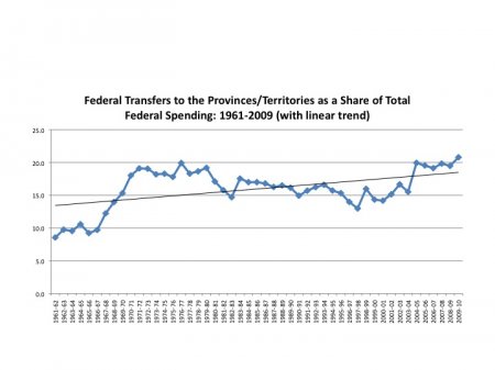
The Evolution of Federal Transfers to the Provinces and Territories
- Feb 12, 2011
- Posted By: Livio Di Matteo
- Tags: canada, federal government, transfer payments
The Fiscal Reference Tables
of the Federal Department of Finance provide a wealth of information on
not only federal but also provincial government revenue and
expenditures. Of particular interest is the series on federal
transfer payments to the provincial and territorial governments.
These transfers currently consist mainly of Equalization, the Canada
Health Transfer, the Canada Social Transfer and the Territorial Funding
Accords. In the early 1960s, the sum of transfers was 642
million dollars whereas by 2009 they had grown to 56.990 billion
dollars. Whereas in 1961, federal transfers to other governments
represented 8.6 percent of total federal expenditures, by 2009 they
represented 20.8 percent (See Figure). Much of the growth occurred
with the expansion of health spending after the onset of Medicare in
1966. What this means is that over a fifty-year period, federal
transfers to the provinces have increased at a faster rate than other
categories of federal spending. However, there are three
distinct transfer spending phases within this pattern of overall
growth:(1) rapid expansion from 1961 to 1971, (2) decline from 1971 to
1997 and (3) recovery and expansion from 1997 to 2009. These
figures provide an interesting background to the coming debate over
federal-provincial transfers with the expiry of the Health Accord in
2014. This accord has expanded federal health transfers to the
provinces at about six percent per year and largely accounts for the
rise in the share of federal spending accounted for by transfers in
2004-05.

Ranking the Prominence of Thunder Bay City Councilors
- Feb 8, 2011
- Posted By: Livio Di Matteo
- Tags: city council, entertainment, rankings, thunder bay
As the accompanying figure illustrates, there are definitely two tiers of councilor when it comes to prominence – the big four: Ken Boshcoff, Rebecca Johnson, Keith Hobbs and Iain Angus with scores ranging from a high of 84.2 to 53.2. Then there is everyone else ranging from Paul Pugh with a score of 13.7 to Joe Virdiramo with a score of 31.3. Put another way, Ken Boshcoff appears to be six times as prominent as either Paul Pugh or Andrew Foulds but then his extensive hits reflect a much longer political career than either of these two relative newcomers. Of course, the interesting outlier is Mayor Keith Hobbs who though a relative newcomer nevertheless ranks third in prominence largely because of his top score in the Google search. It should also be noted that there are no ward councilors in the top four.
Just for fun, I also subjected myself to the same search procedure and have included my score in the mix also with my index score relative to the top councilor score. For example, for the CJ Archive score, I come out at 15.3 (edging out Paul Pugh and Andrew Foulds) while my Google score relative to the highest municipal politician at 100 was actually 145.3 (topping Mayor Hobbs) for an average score of 80.3.
Figure 1

What do these rankings mean? Perhaps nothing at all, other than the ability to have your own web presence and insinuate yourself into the local media. After all, marketing is everything. On the other hand, if you are getting mentioned enough on the web and in the local paper, perhaps it is because you are getting things done and are involved in many accomplishments. Or perhaps it is because you have become somewhat notorious. The searches for example often illustrate hits for Thunder Bay councilors related to controversial issues such as the location of windmills or tax and budgetary issues. All in all, politics is about getting noticed and these rankings suggest some politicians are able to get themselves more noticed than others – whether the reasons are good or bad.
Government Drug Spending and Drug Stores
- Feb 6, 2011
- Posted By: Livio Di Matteo
- Tags: canada, drug expenditures, economics, health, provinces, retail outlets
The Globe and Mail had an interesting business story in Saturday’s paper on how Shoppers Drug Mart will be dealing with declining profits due to increased competition and also in part as a result to changes in
provincial government drug plans particularly in Ontario and Quebec.
All provinces have provincial government drug plans for individuals on
income assistance and those aged 65 and over. With rising costs,
provinces have been looking at ways to cut costs and Ontario and Quebec
are looking at reforms. Ontario has already banned professional
allowances –payments to pharmacies from generic drug companies – that
were costing the provincial government as much as 800 million dollars a
year.
What was interesting about the Globe and Mail story was the graphic on the number of Shoppers Drug Mart stores in each province. The numbers are reproduced in Figure 1 below and show that Ontario had the most stores at 611 while PEI had the fewest at 5. Of course, population and market size is a factor in the number of stores so the number of stores per 100,000 people might be a better indicator. This is provided in Figure 2 and it turns out that the most stores adjusting for population are actually in New Brunswick with 5.6 stores per 100,000 followed by Newfoundland and then Ontario. Quebec has the fewest Shoppers Drug Marts at 2.2 per 100,000.
Figure 1

Figure 2

While a number of economic and business factors could influence the number of stores, is there any evidence that more generous government drug plans has helped fuel the expansion of Shoppers in certain provinces? After all, as all economists know, if you want less of something, you should tax it while if you want more of anything, subsidize it. Figure 3 presents some simple evidence on nominal provincial government drug spending per capita obtained from the Canadian Institute for Health Information to see if there is any relationship between the number of Shoppers Drug Marts and the generosity of provincial drug spending. The results are mixed.
Figure 3

The top five spenders per capita have an average of 3.79 stores per 100,000 population while the bottom 5 spenders have 3.76 – hardly a major difference. Quebec and Ontario are the highest per capita spenders on government drug plans but rank 10th and 3rd respectively in the number of stores per 100,000 population. Manitoba and BC spend the least on provincial government drug spending and rank 7th and 8th respectively in terms of the number of stores per 100,000 population. These rankings suggest that any positive relationship between the generosity of provincial government drug spending and the number of Shoppers Drug Marts is likely confounded by other factors such as urban size and the minimum scale of store required as well as the amount of competition from other chains and generics. For example, London Drugs is a major competitor in Western Canada and three of the four western provinces are in the bottom half in terms of number of stores per 100,000 population. All in all, fascinating stuff.